International Airport Rankings and Busiest Air Routes around the World
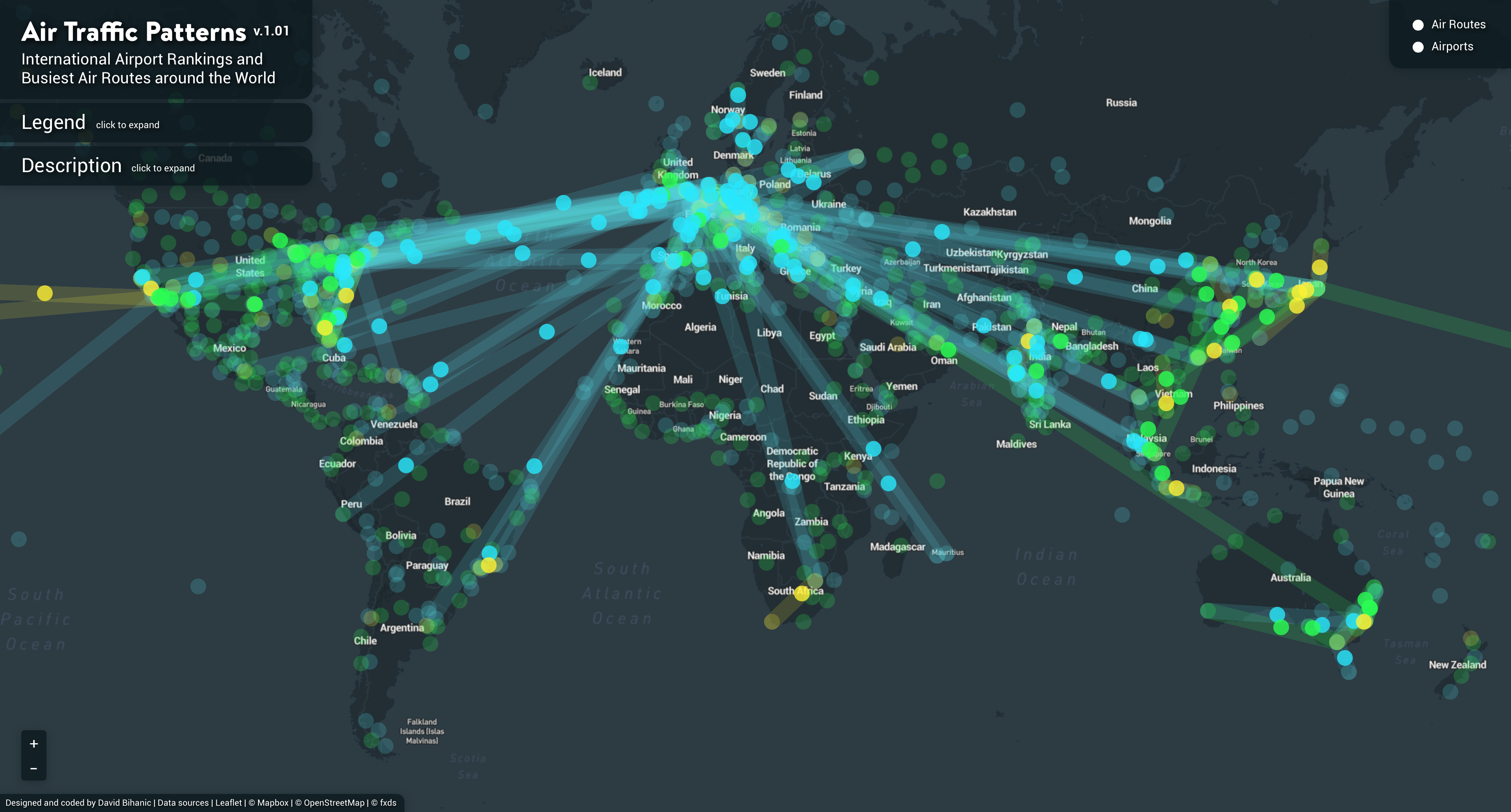
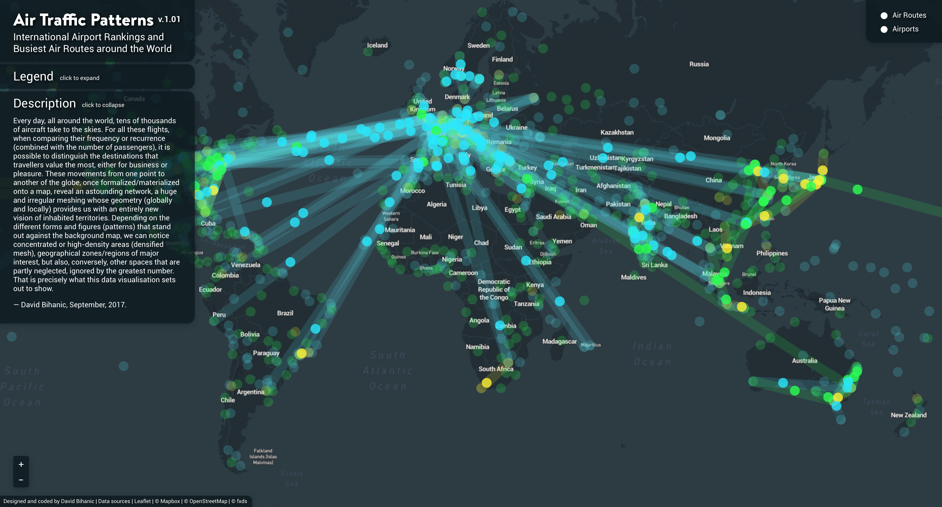
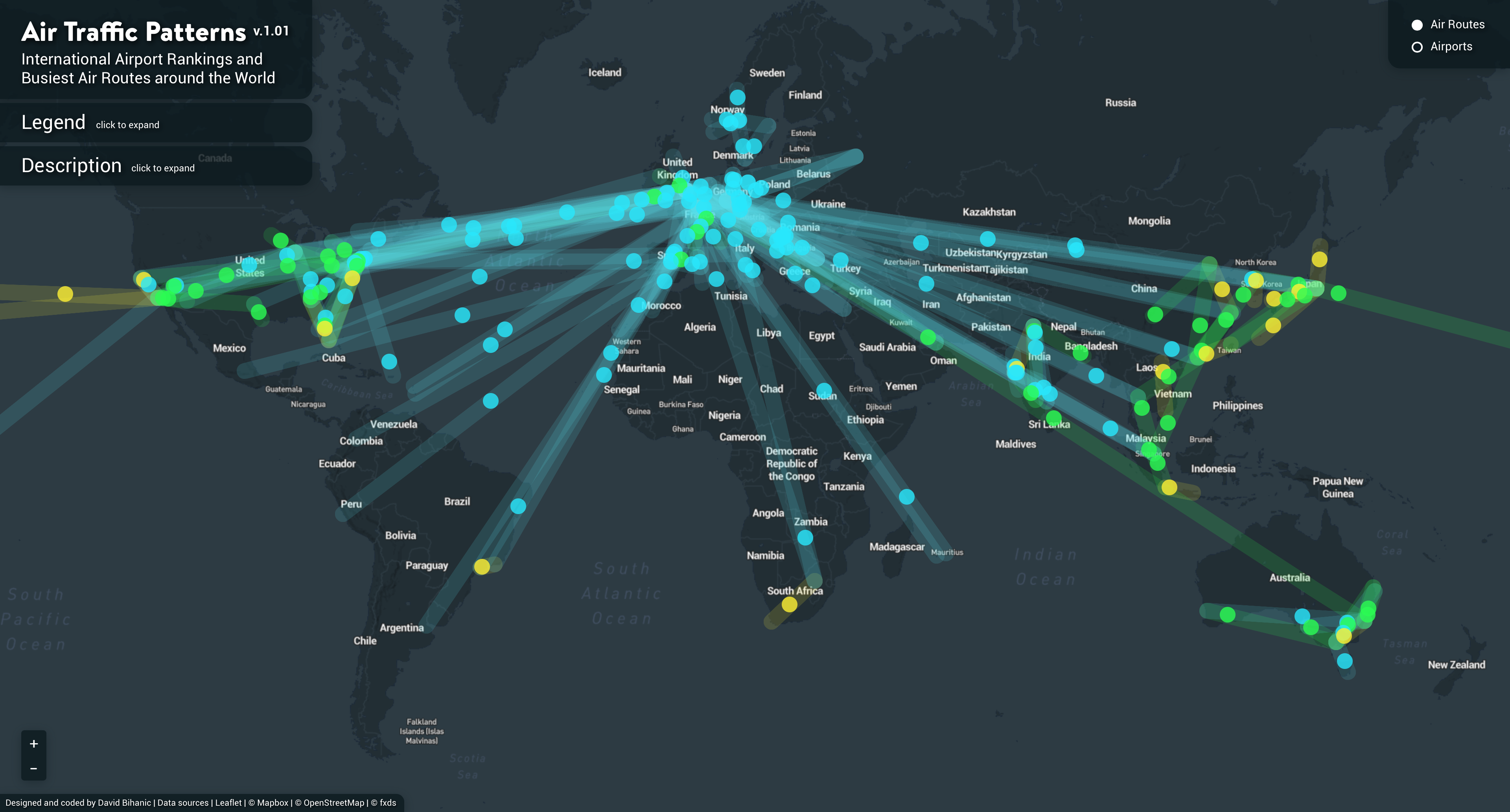
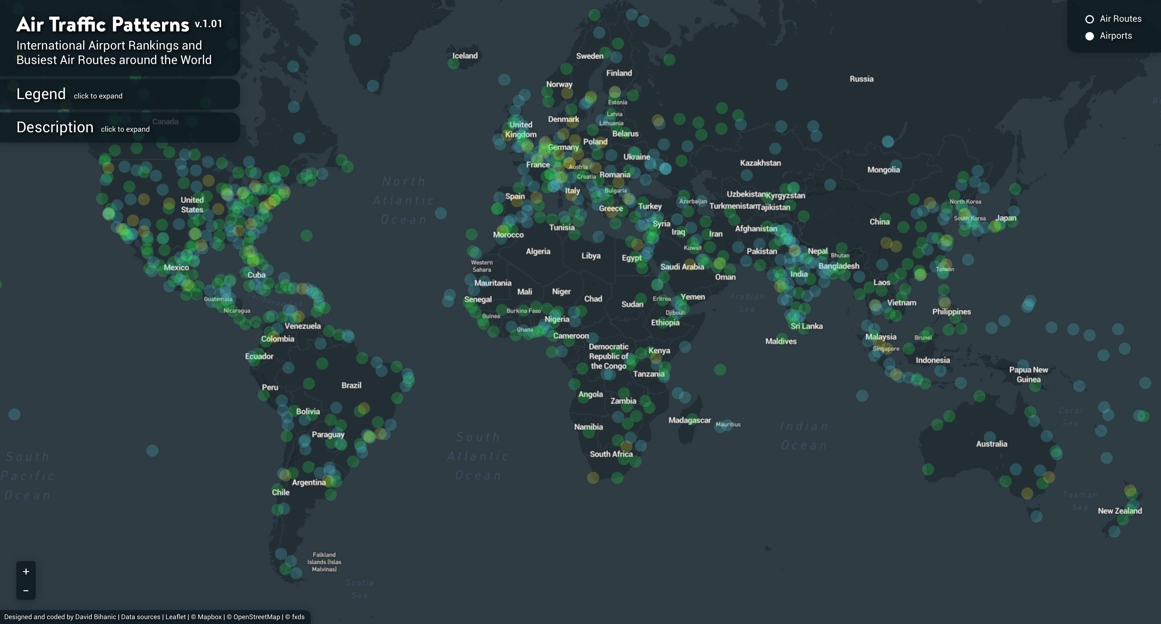
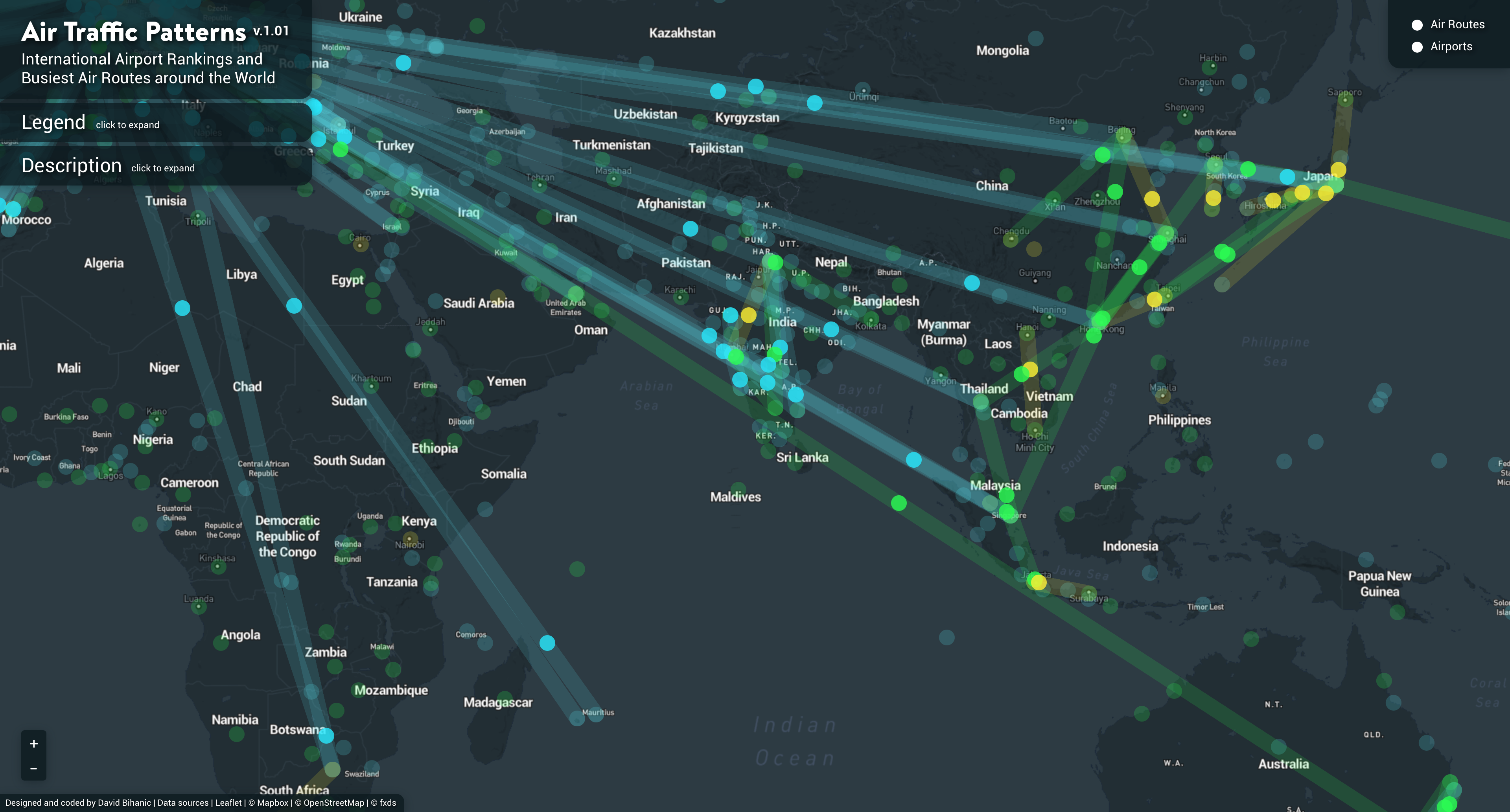
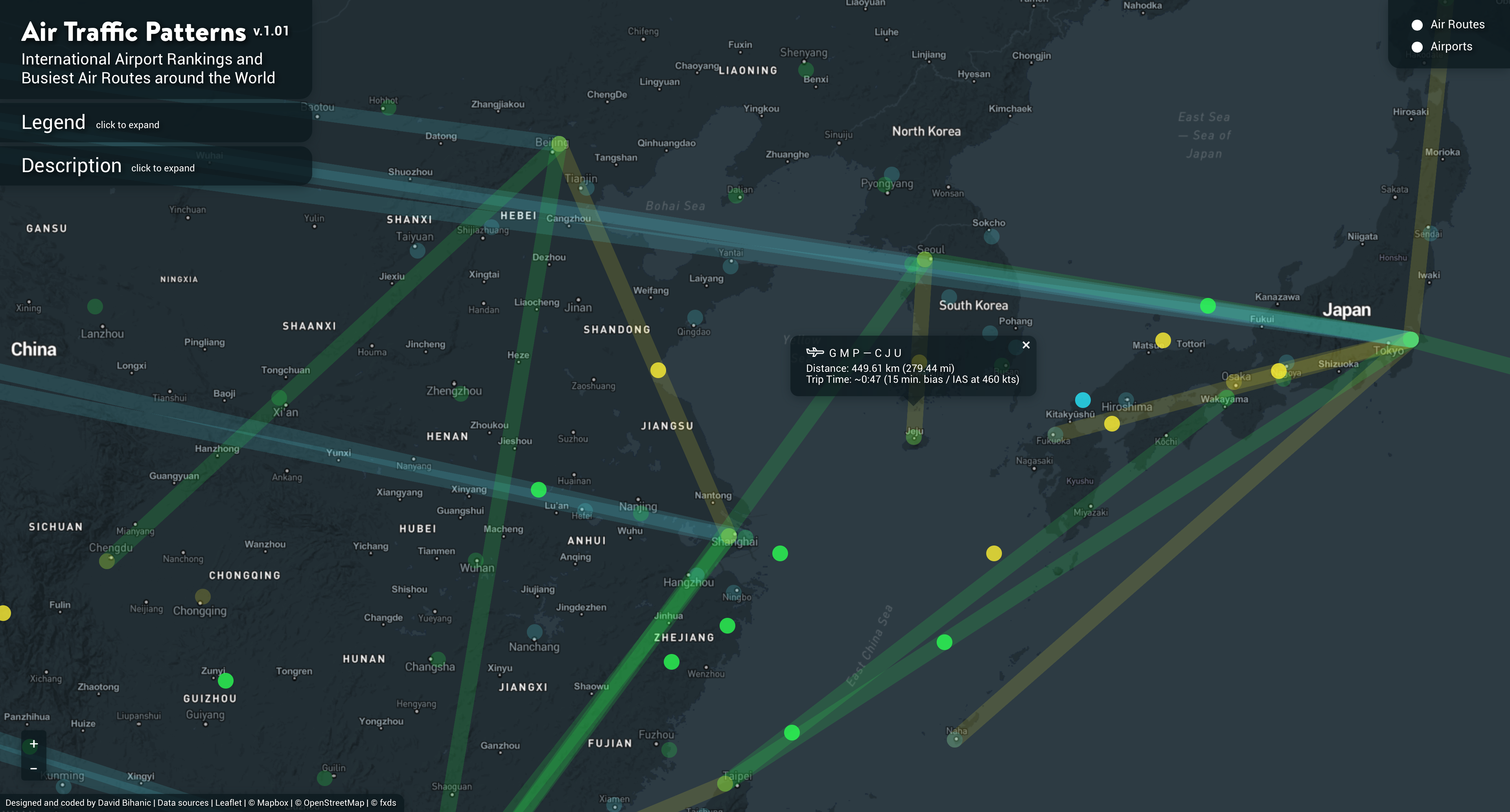
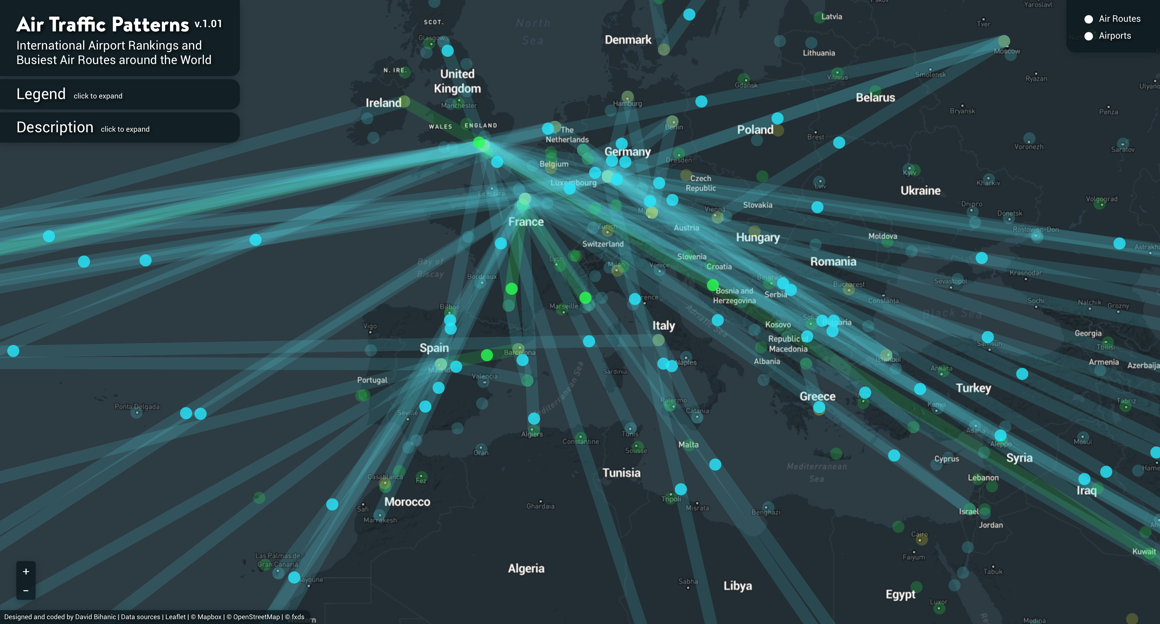
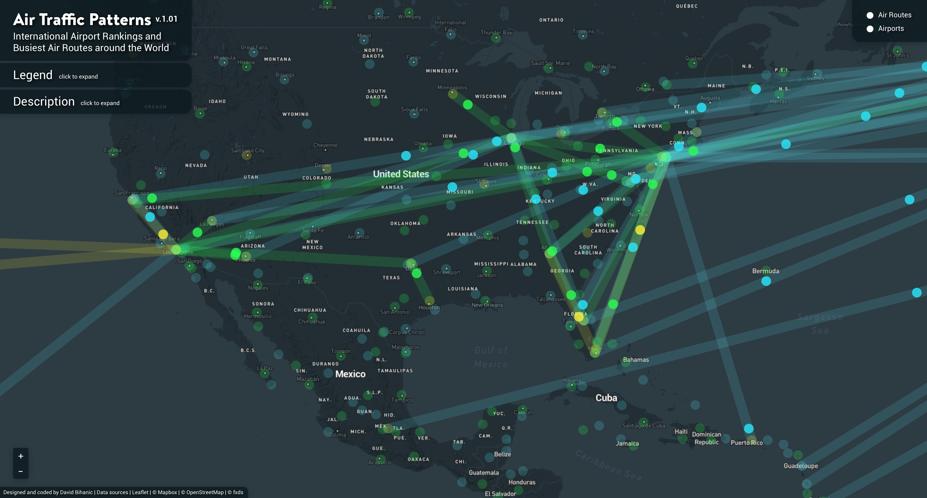
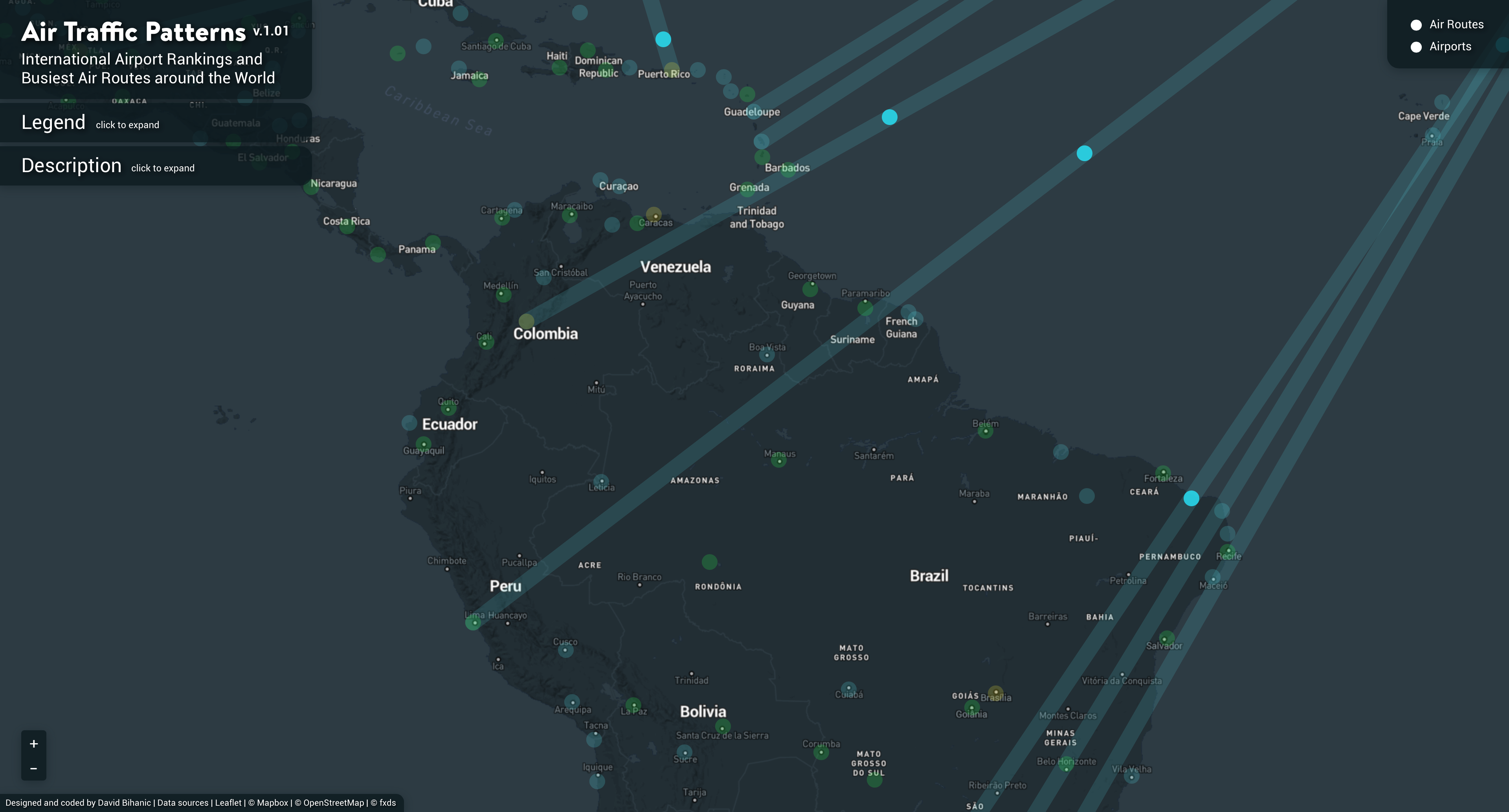
Every day, all around the world, tens of thousands of aircraft take to the skies. For all these flights, when comparing their frequency or recurrence (combined with the number of passengers), it is possible to distinguish the destinations that travelers value the most, either for business or pleasure. These movements from one point to another of the globe, once formalized/materialized onto a map, reveal an astounding network, a huge and irregular meshing whose geometry (globally and locally) provides us with an entirely new vision of inhabited territories. Depending on the different forms and figures (patterns) that stand out against the background map, we can notice concentrated or high-density areas (densified mesh), geographical zones/regions of major interest, but also, conversely, other spaces that are partly neglected, ignored by the greatest number.
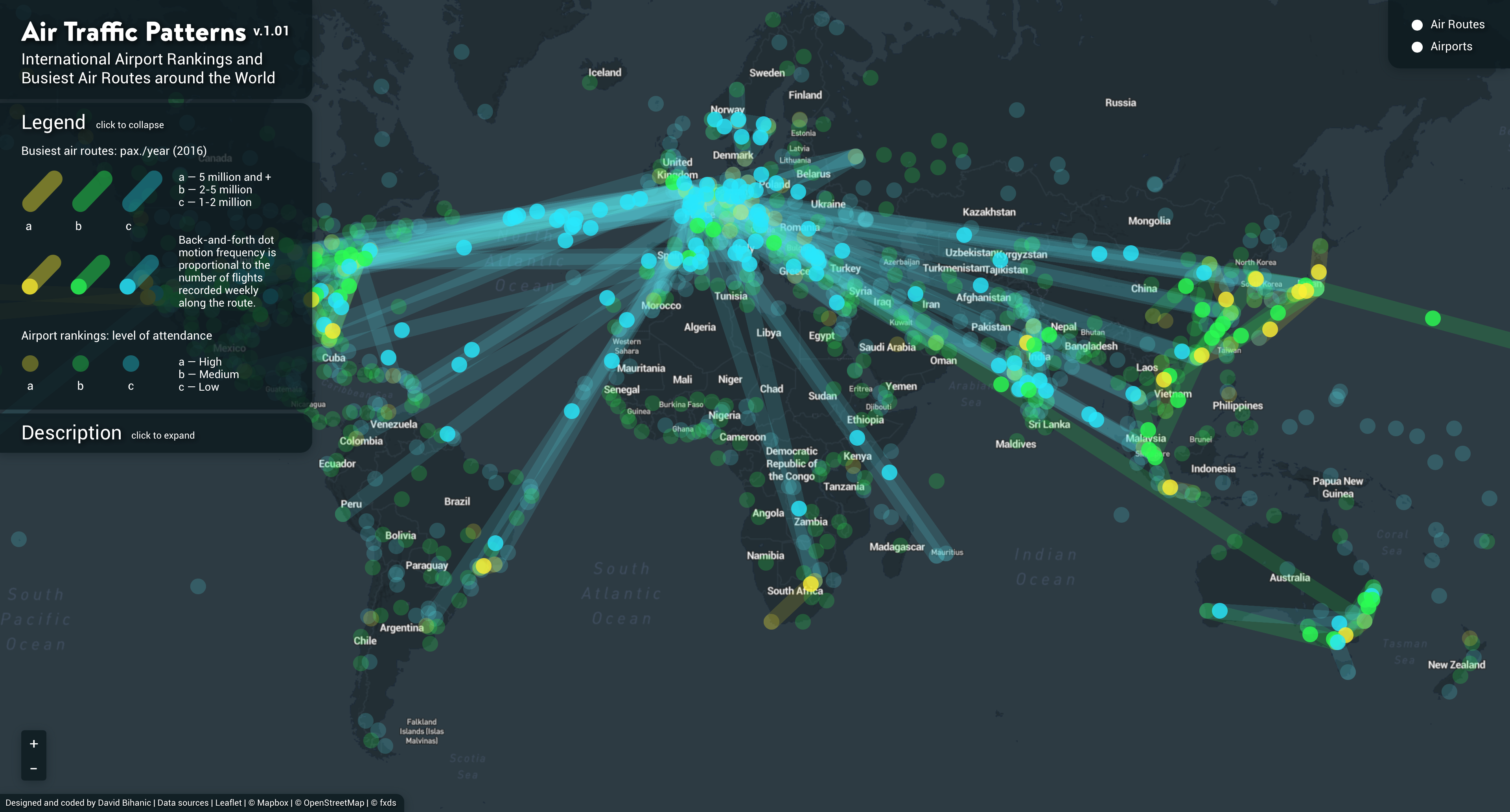
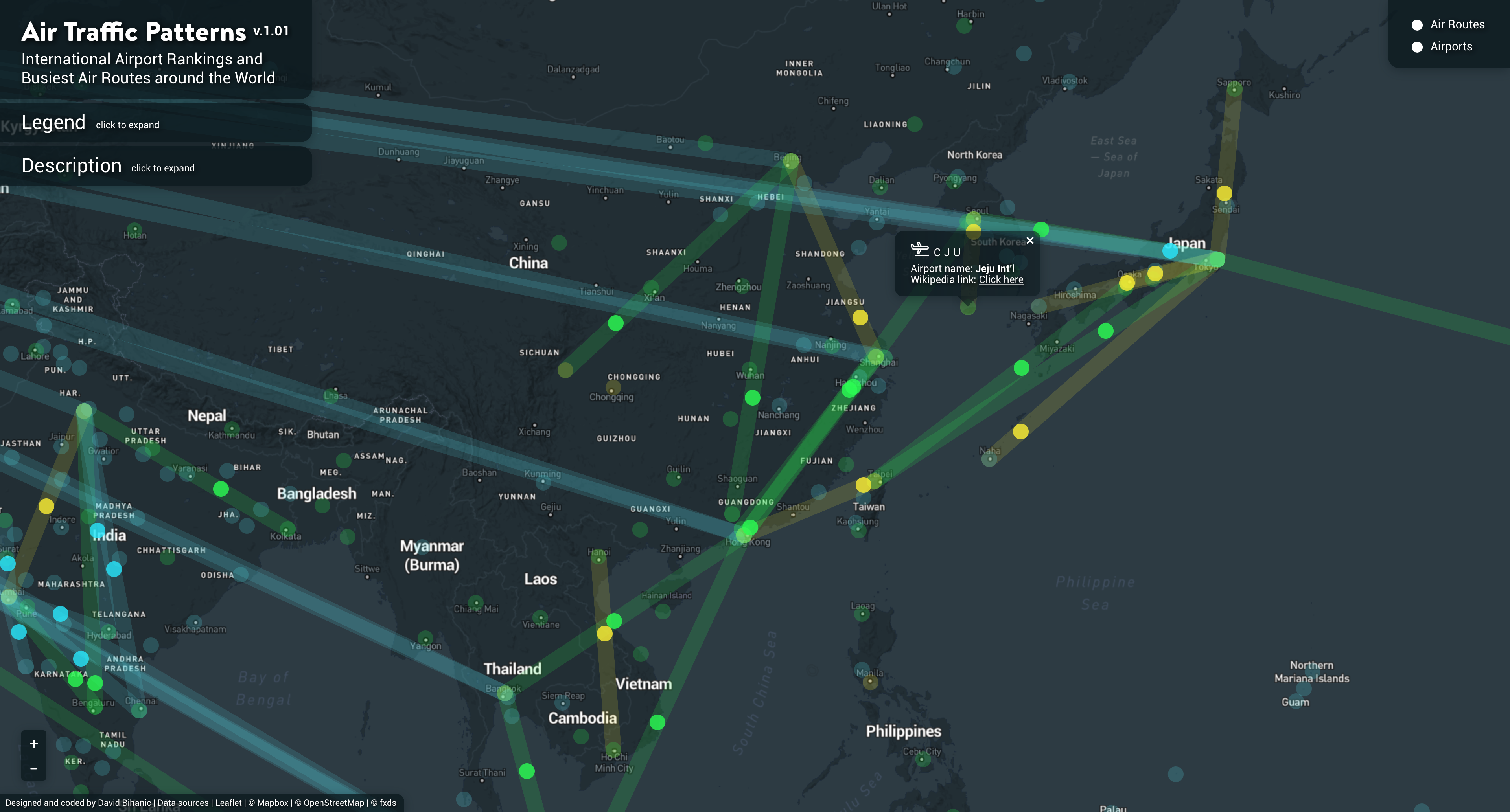
That is precisely what this data visualization sets out to show. The colored vectors represent the most traveled air routes—three categories are calculated based on the number of passengers per year (2016), each is given a specific color. Moving dots symbolize the numerous flights in and out; their speed depends on the number of flights recorded weekly. A myriad of fixed dots identify the location of major airports around the world. Color coding allows differentiating them according to their level of attendance—a three-level scale is chosen. Tooltips are available by clicking on each vector or dot, each incorporates additional information: distance in kilometers/miles between two points (flights from one airport to another) and time trip; names of each airport and the link to their Wikipedia page).
Chaque jour, partout dans le monde, des dizaines de milliers d’avions sillonnent les cieux. Parmi ces vols, si l’on compare leur fréquence ou récurrence (à croiser avec le nombre de passagers), il peut être isolées des destinations qui emportent nettement la préférence des voyageurs, tourisme d’affaire et d’agrément ici confondus. Ces déplacements d’un point à un autre du globe, une fois matérialisés sur une carte, compose un maillage, une résille irrégulière dont la géométrie (globale et locale) nous offre une toute autre lecture des territoires habités. Selon les formes ou figures qui s’en détachent (motifs), elle fait apparaître des zones de concentration (mailles resserrées), de densification, des aires géographiques d’intérêt majeur tandis qu’elle libère d’autres espaces pour partie négligés, délaissés par le plus grand nombre.
C’est précisément ce que donne à voir cette visualisation de données. Les vecteurs tracés sur le planisphère représentent les routes aériennes les plus empruntées—3 couleurs les distinguent suivant le nombre de voyageurs. Des points mobiles symbolisent les allers-retours des appareils ; leur vitesse d’exécution est alors fonction du nombre de vols enregistrés quotidiennement. D’autres points, fixes cette fois, situent les principaux aéroports dans le monde entier. Leur code couleur permet, là encore, de les différencier par niveau de fréquentation—une échelle à 3 niveaux a été retenue. Des infobulles sur les vecteurs et les points intègrent d’autres informations complémentaires : distance entre deux points (vol d’un aéroport à un autre) et durée de vol, nom des aéroports et liens vers leur page wikipédia.
URL: http://www.davidbihanic.com/airtraffic
Screenshots
Screencast
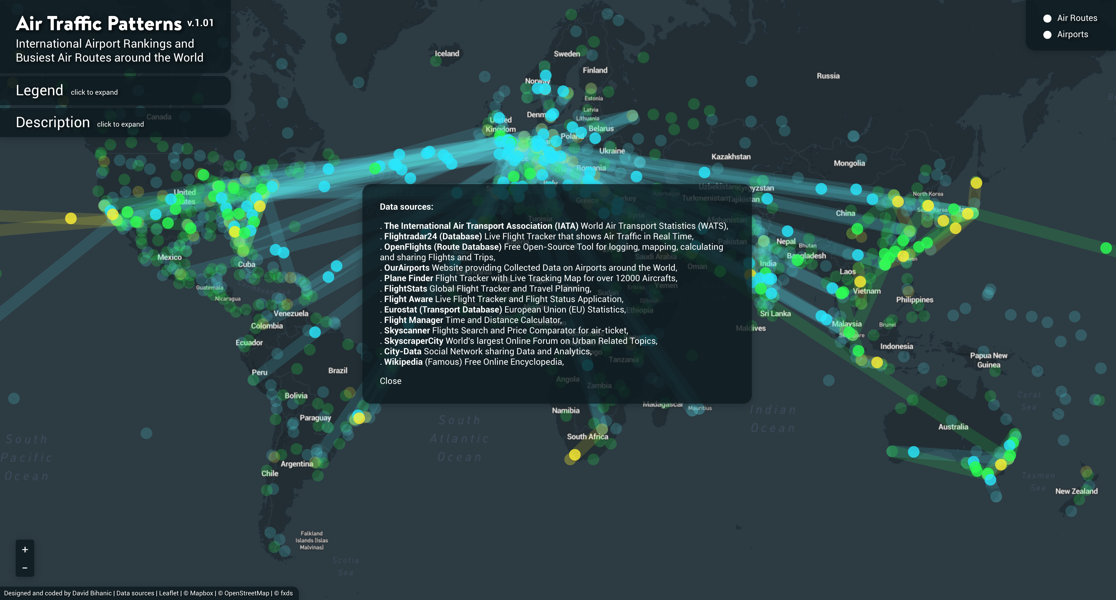
Data sources
The International Air Transport Association (IATA) World Air Transport Statistics (WATS); Flightradar24 (Database) Live Flight Tracker that shows Air Traffic in Real Time; OpenFlights (Route Database) Free Open-Source Tool for logging, mapping, calculating and sharing Flights and Trips; OurAirports Website providing Collected Data on Airports around the World, Plane Finder Flight Tracker with Live Tracking Map for over 12000 Aircrafts; FlightStats Global Flight Tracker and Travel Planning; Flight Aware Live Flight Tracker and Flight Status Application; Eurostat (Transport Database) European Union (EU) Statistics; Flight Manager Time and Distance Calculator; Skyscanner Flights Search and Price Comparator for air-ticket; SkyscraperCity World’s largest Online Forum on Urban Related Topics; City-Data Social Network sharing Data and Analytics; Wikipedia (Famous) Free Online Encyclopedia.
Special thanks to
* Thomas Dubot, Xavier Olive and Thomas Polacsek from the French Aerospace Lab for their assistance in finding reliable data sources,
* Thibault Jaillon (my Yoda in the art of coding) for his invaluable advice and guidance.
This data visualization was designed and coded by David Bihanic (2017).
Exhibition
* “Designers du Design” exhibition curated by Jean-Louis Fréchin and Loïc Le Guen (Nodesign agency), at the Tripostal—Lille (from September 16, to November 15, 2020). This exhibit is part of the official program of Lille Metropole 2020 World Design Capital (labelled by the World Design Consortium—WDC).
To mention: David Bihanic, “Air Traffic Patterns: International Airport Rankings and Busiest Air Routes around the World”, September 2017. Retrieved from davidbihanic.com/airtraffic